I Turned Every Goal Scored In The NHL Since 2023 Into A Star Chart
As I was biding my time, waiting for the NHL’s offseason to end, I had the chance to revisit a favorite visualization of mine, the Map of Github.
The visualization is generated by clustering all github repositories based on how similar they are and then creating a fake map from those clusters. I love it for 2 really simple reasons:
- I think it’s a really unique idea
- It’s just fun
And so I set about re-creating it, but with an NHL spin.
Getting Started
The Map of Github is broken down into Continents, Countries, and Cities. I wanted to keep the same spirit of these groupings and then sub-groupings of the data but I had to figure out how to apply that to goals in the NHL.
Every goal can just be thought of as a vector, where each number in the vector corresponds to an attribute. All that was left was just determining what attributes of the goal I wanted to use. I have a lot of experience with hockey data so I felt pretty confident in using:
x coordinatey coordinateperiodperiod timeteam scoreopponent scoreshot typegame stateplayer idteam idgoalie id
Now that I had my vector, I had to figure out how to re-create the layers of groupings. The lowest level is always the object that is being compared so I knew my Cities would be the goals themselves. To get to Continents and Countries, I decided to perform multiple layers of clustering. Looking at the variables, each could be sort of grouped into the type of information it was providing about the goal. There were variables giving shot context, game context, and player context. I decided to just go with that
- Shot context == Continents
- Game context == Countries
- Players Involved == ?
- Goals == Cities
The player information really didn’t fit into an existing “level” from the original idea but I knew I really wanted to include that information because I had it and I thought it would be fun to see if there were any goals scored by the same player/goalie combinations. With the geographic metaphor starting to break down, I turned towards astronomy. I needed a concept with more layers of hierarchy and astronomy fit that mold really well. A universe of galaxies, clusters, and solar systems felt like a much better fit for the different contexts of the data and conveniently had its own unique way of being visualized in star charts. The vision really started to come together in my head. My newly inspired clusters now looked like:
- Shot context == Galaxies
- Game context == Clusters
- Players Involved == Solar Systems
- Goals == Stars
Clustering NHL Goals
With the overall context figured out and the data gathered, I just had to cluster the data! If only it were that easy… I ended up going through a lot of trial and error. I spent a lot of time messing around with different algorithms but no matter what I tried I couldn’t get anything to look decent. No matter what algorithm I tried, I just wasn’t getting clearly defined clusters.
The main problem was actually with the data. Most of the data I had selected was continuous data. This was giving me a ton of issues when I went to do unsupervised clustering because NHL goals tend to be extremely random and well distributed. This forced me to re-examine the data and go back to the drawing board. My goal was to turn my highly continuous variables into something a little more discrete.
Coordinates
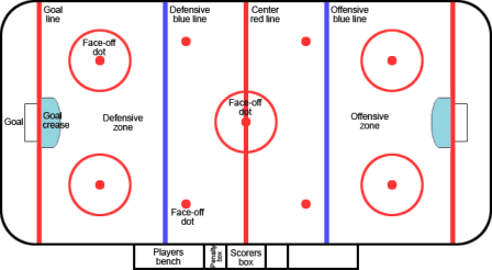
I turned the x and y coordinate values into a single shot_zone. The offensive zone can be bucketed into different “zones”.

The zones I chose were “Left Faceoff Circle”, “Right Faceoff Circle”, “Slot”, “Left Point”, “Right Point”, and “Point”.
Score
Using team score and opponent score individually created a huge number of possible combinations, essentially making the field useless. I shifted towards using a new field called score_differential. This was just calculated with team_score - opponent_score.
Time
Using period and period_time separately was a mistake. It was easy for clustering algorithms to pick up on the period but the period time was essentially useless. I ended up combining these fields into a single field called game_time. This was just a calculation of (period * 20) + period_time to give you the amount of time into the game a goal was scored. Of note, this field still contains a lot of potential variations but I did have better results going this route. It could be something potentially improved in the future.
IDs
Astute readers may have noticed that the initial pass of variables I said I would use included player id and goalie id. I had a huge face palm moment when I realized these fields were contributing to bad cluster results because the IDs mean nothing. 2 players who are one ID apart have nothing in common with each other. I swapped all of the ID fields out for the actual names and ended up using the Damerau-Levenshtein distance between a concatanation of player_name + goalie_name to build a similarity matrix and then only grouped distances above a certain threshold.
With all of these changes, I was finally able to get some real results.
I spent a lot of time talking about the data preparation because the honest truth is the clustering was rather boring. I tried many different clustering algorithms including k-means, agglomerative clustering, dbscan, and hdbscan. I found myself having the best results with hdbscan, although once I made the data changes, I think really any of them could have worked. One specific design decision I made was to use the UMAP algorithm as a step prior to clustering in order to further reduce the dimensionality of the data. Even with the changes I made to make my data more discrete, there was a lot of benefit in reducing it further as a pre-processing step.
I also found that removing team from the list of features to be beneficial. There was just a lot of noise there when clustering and reduced the cluster quality I was aiming for.
Once I was happy with the cluster’s, I turned toward an LLM to name each celestial object. Here is the prompt that was used
You are tasked with creating a <celestial level> name for a project which maps all of the goals scored in the NHL into a constellation map. The name should make sense based on the attributes of the goals contained in the cluster and should resemble names used in astronomy for our real universe.
Please provide only the name (2-3 words maximum), no explanation. The name should be evocative of the goal characteristics and follow astronomical naming conventions. Do not use a name in goalies faced unless a goalie name appears 4 or more times based on the provided context(we are using pandas value_counts() to get the count). For situations, 5v4, 6v4, 5v3, 4v3 are powerplays and 4v5, 4v6, 3v5, 3v4 are shorthanded. 5v6 is on an empty net and 6v5 is scoring with an extra player because your net is empty.
Some context for the goals in this grouping are: <data context>.
Visualizing The Data
I struggled a lot more than I thought I would with how to visualize this data. I knew I wanted to keep the spirit of the Map of Github and have something I could pan around.
My first attempt at doing this looked very similar to the map of github. It was a website where you could pan around and see different levels of cosmological objects. You could zoom into see what was contained and click on each object for a description of what it contained. It ended up being terrible.
For one, people had no clue what they were looking at. An underrated part of the Map of Github is that its easy to understand. By performing layers of clustering and adding extra levels, I had unintentionally complicated the entire process. Second, it was terrible on a mobile device.
This caused me to really re-think what I wanted. One thing about the original visualization is that it doesn’t really claim to be that useful. As I mentioned in why I liked it, its just fun. I decided to lean into this. One fun thing that we do when looking up at the stars is coming up constellations and so that’s where I went.
Round 2 of the UI was constellation-discoverer. The entire universe was on display and just by searching for a player, you could highlight all of their goals in space and create a constellation from it. In addition, I was able to add highlight clips from the NHL data so you could watch all of the goals involved in the constellation. It also actually worked on a mobile device.
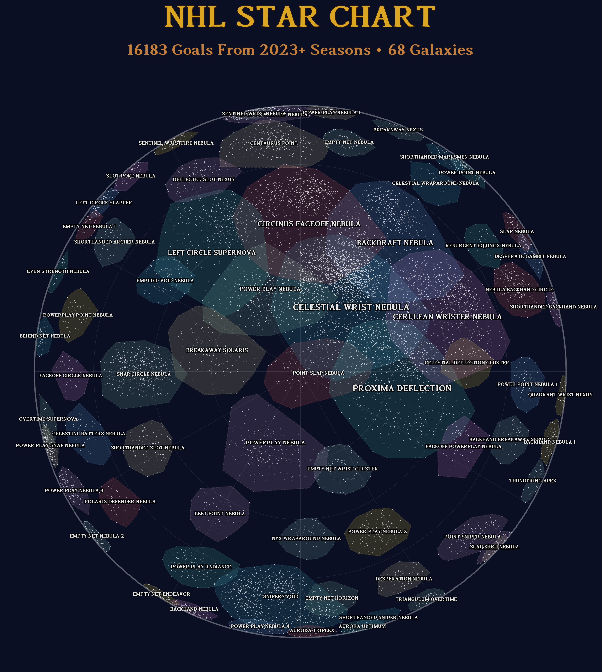
Finally, I knew I wanted to create a star chart. I love those fisheye maps of the sky and thought this would fit perfectly. And so without further ado, the final product

Wrapping Up
All in all, I was very happy with the results. I think the star chart is cool and the constellation creator is both an interesting way to view the data and, at worst, just a way to watch clips of goals from certain players. The original UI is still my favorite because there are a lot of fun nuggets to be discovered such as:
- Goals scored from behind the net by players with their first name starting with ‘Mat’
- Slap shots from the left circle given up by Jordan Binnington in close games
- 6v5 goals given up by Jeremy Swayman
- Nico Hischier tipped goals in the slot on a 5v4 power play
Was this a super niche project? Yes, I am not sure you could get more niche if you tried. But did I have fun along the way? Yes, and that’s all that matters. October 7th can’t come soon enough.